
Reactのコンポーネントってとっても細分化されますよね。
それに、ある特定のCSSを適用させたいときには、「そのコンポーネントのタグだけに適用させたい」と考える場面は当然あるでしょう。
ということで、特定コンポーネントだけに適用できる『css in js』をご紹介。
css in jsを実現するためのライブラリ
css in jsを実現するためには、ライブラリを使用します。
といったライブラリです。
この記事では、styled componentsを使って進めます。
styled componentsのインストール
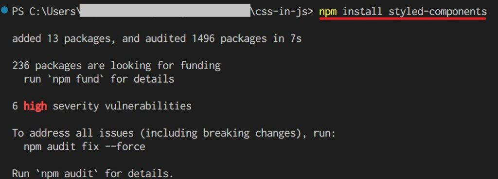
npm install styled-components
styled componentsを使用するディレクトリで上記のnpmコマンドをインストールしましょう。
それだけです。
VSCodeを使っている方は『vscode-styled-components』という拡張機能をインストールすると、cssがハイライトされて便利!
スタイルを適用するjsxサンプル(App.js)
jsxはApp.jsに直接書きました。
import { useState } from 'react';

import styled from 'styled-components';

function App() {
  const [isSelected, setIsSelected] = useState(false);

  const clickHandler = () => setIsSelected((prev) => !prev);
  return (
    <div className="App">
      <h2>「css in js」のテスト</h2>
   {// ここにボタンのコンポーネントを書きます。}
      <div style={{ textAlign: "center" }}>
        {isSelected && "クリックされました。"}
      </div>
    </div>
  );
}

export default App;
「// ここにボタンのコンポーネントを書きます。」の所に、styled componentsで作成したスタイルコンポーネントを書いていきます。
styled componentsのインポート
cssを当てたいコンポーネントのファイルにstyled componentsをインポートします。
今回の場合は、App.jsですね。
import styled from "styled-components";
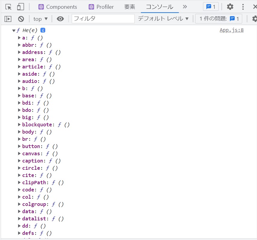
インポートした「styled」の中に、HTMLのタグと同じだけのプロパティが用意されています。
試しに、
consol.dir(styled);
とコードを書いてstyledの中を表示させると、HTMLのタグに対応したプロパティが確認できます。
styled componentsを適用する
スタイル付きのコンポーネント定義
styled componentsでは、コンポーネントの中にスタイル付きのコンポーネントが定義できます。
分かりにくいですが、当該記事の場合はAppコンポーネントの中にStyledButtonコンポーネントを定義したということですね。
例えば、ボタンにスタイルを付けたい場合には、こんな感じになります。
const StyledButton = styled.button`
  margin-inline: auto;
  border-radius: 9999px;
  border: none;
  display: block;
  width: 120px;
  height: 60px;
  margin: 10px auto;
  font-weight: bold;
  cursor: pointer;
  `;
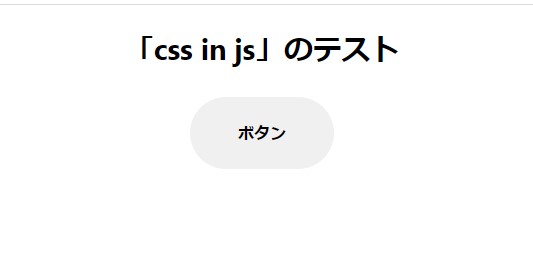
これは、ボタンタグにスタイルを付けた「StylesButton」というコンポーネントを定義していることになります。
これをjsx内に展開すると、スタイリングされたボタンが出現します。
import React from 'react';
import './App.css';

import { useState } from 'react';

import styled from 'styled-components';

// ----------------------------------------
// スタイル付きのタグ定義
const StyledButton = styled.button`
  margin-inline: auto;
  border-radius: 9999px;
  border: none;
  display: block;
  width: 120px;
  height: 60px;
  margin: 10px auto;
  font-weight: bold;
  cursor: pointer;
  text-align: center;
  line-height: 60px;
  `;
//------------------------------------------

function App() {
  const [isSelected, setIsSelected] = useState(false);

  const clickHandler = () => setIsSelected((prev) => !prev);
  return (
    <div className="App">
      <h2>「css in js」のテスト</h2>
       {/* StyledButtonコンポーネントを追記 */}
      <StyledButton>ボタン</StyledButton>
      <div style={{ textAlign: "center" }}>
        {isSelected && "クリックされました。"}
      </div>
    </div>
  );
}

export default App;
styled componentsにpropsを渡す
styled componentsにpropsを渡すこともできます。
つまり、処理次第で、スタイリングを変えることができるということですね。
import React from 'react';
import './App.css';

import { useState } from 'react';

import styled from 'styled-components';

// ----------------------------------------
const StyledButton = styled.button`
  margin-inline: auto;
  border-radius: 9999px;
  border: none;
  display: block;
  width: 120px;
  height: 60px;
  margin: 10px auto;
  font-weight: bold;
  cursor: pointer;
  text-align: center;
  line-height: 60px;
// propsでボタンのbackground-colorを変える
  background-color: ${({ isSelected }) => isSelected ? 'skyblue' : ''};
  `;
//------------------------------------------

function App() {
  const [isSelected, setIsSelected] = useState(false);

  const clickHandler = () => setIsSelected((prev) => !prev);
  return (
    <div className="App">
      <h2>「css in js」のテスト</h2>
       {/* StyledButtonコンポーネントにpropsとクリックハンドラーを追加 */}
      <StyledButton isSelected={isSelected} onClick={clickHandler}>ボタン</StyledButton>
      <div style={{ textAlign: "center" }}>
        {isSelected && "クリックされました。"}
      </div>
    </div>
  );
}

export default App;
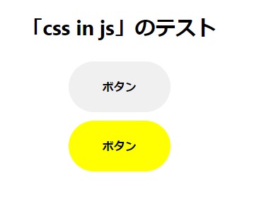
ボタンをクリックすると、ボタンの色がskyblueになる処理を書きました。
StyledButtonコンポーネントに「isSelected={isSelected}」というようにpropsを追加して、styled.button“のタグ付きテンプレートの中の「background-color: ${({ isSelected }) => isSelected ? ‘skyblue’ : ”};」でpropsを判断して、ボタンのbackground-colorをskyblueに変えています。
スタイリングコンポーネントの継承
styled componentsでは、コンポーネントの継承ができます。
同じような記述をしなくていいので助かりますね。
import React from 'react';
import './App.css';

import { useState } from 'react';

import styled from 'styled-components';

// ----------------------------------------
// スタイル付きのタグ定義
const StyledButton = styled.button`
  margin-inline: auto;
  border-radius: 9999px;
  border: none;
  display: block;
  width: 120px;
  height: 60px;
  margin: 10px auto;
  font-weight: bold;
  cursor: pointer;
  text-align: center;
  line-height: 60px;
  background-color: ${({ isSelected }) => isSelected ? 'skyblue' : ''}; // propsでボタンのbackground-colorを変える
  `;

  // 継承を使った定義
  const YellowButton = styled(StyledButton)`
    background-color: ${({ isSelected }) => isSelected ? 'aqua' : 'yellow'};// StyledButtonを継承したコンポーネント
    :hover { color: red; }
  `;
//------------------------------------------

function App() {
  const [isSelected, setIsSelected] = useState(false);

  const clickHandler = () => setIsSelected((prev) => !prev);
  return (
    <div className="App">
      <h2>「css in js」のテスト</h2>
      <StyledButton isSelected={isSelected} onClick={clickHandler}>ボタン</StyledButton>
      {/* StyledButtonを継承したYellowButtonを追加 */}
      <YellowButton  isSelected={isSelected} onClick={clickHandler}>ボタン</YellowButton>
      <div style={{ textAlign: "center" }}>
        {isSelected && "クリックされました。"}
      </div>
    </div>
  );
}

export default App;
const 「継承先コンポーネント」 = styled(「継承元コンポーネント」)`「継承先独自の定義」`;
というように継承先のコンポーネントを作ればいいのですね。
サンプルでは、「承先コンポーネント:YellowButton」、「継承元コンポーネント:StyledButton」となっており、background-colorと:hoverを追加して継承元と異なるようにしています。
メディアクエリーを使う
styled componentsはメディアクエリーも使用可能。
import React from 'react';
import './App.css';

import { useState } from 'react';

import styled from 'styled-components';

// ----------------------------------------
const StyledButton = styled.button`
  margin-inline: auto;
  border-radius: 9999px;
  border: none;
  display: block;
  width: 120px;
  height: 60px;
  margin: 10px auto;
  font-weight: bold;
  cursor: pointer;
  text-align: center;
  line-height: 60px;
  background-color: ${({ isSelected }) => isSelected ? 'skyblue' : ''};

  //600px以下はボタンを四角にするメディアクエリーを追記
  @media (max-width: 600px) {
    border-radius: 0;
  }
  `;

  const YellowButton = styled(StyledButton)`
    background-color: ${({ isSelected }) => isSelected ? 'aqua' : 'yellow'};
    :hover { color: red; }
  `;
//------------------------------------------

function App() {
  const [isSelected, setIsSelected] = useState(false);

  const clickHandler = () => setIsSelected((prev) => !prev);
  return (
    <div className="App">
      <h2>「css in js」のテスト</h2>
      <StyledButton isSelected={isSelected} onClick={clickHandler}>ボタン</StyledButton>
      <YellowButton  isSelected={isSelected} onClick={clickHandler}>ボタン</YellowButton>
      <div style={{ textAlign: "center" }}>
        {isSelected && "クリックされました。"}
      </div>
    </div>
  );
}

export default App;
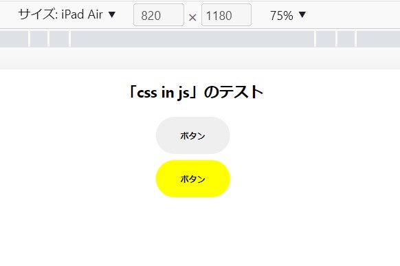
600px以下はボタンを四角形にします。
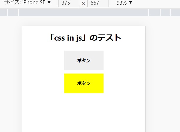
600pxより大きいと、角が取れます。
ネストを使う
styled componentsはネストも使えます。
import React from 'react';
import './App.css';

import { useState } from 'react';

import styled from 'styled-components';

// ----------------------------------------
const StyledButton = styled.button`
  margin-inline: auto;
  border-radius: 9999px;
  border: none;
  display: block;
  width: 120px;
  height: 60px;
  margin: 10px auto;
  font-weight: bold;
  cursor: pointer;
  text-align: center;
  line-height: 60px;
  background-color: ${({ isSelected }) => isSelected ? 'skyblue' : ''};
  // spanをネストしてStyledButtonコンポーネントの中のspanタグの中だけを0.5emにする
    span {
      font-size: 0.5em;
    }

  @media (max-width: 600px) {
    border-radius: 0;
  }
  `;

  const YellowButton = styled(StyledButton)`
    background-color: ${({ isSelected }) => isSelected ? 'aqua' : 'yellow'};
    :hover { color: red; }
    // spanをネストしてYellowButtonコンポーネントの中のspanタグの中だけを2emにする
    span {
      font-size: 2em;
    }
  `;
//------------------------------------------

function App() {
  const [isSelected, setIsSelected] = useState(false);

  const clickHandler = () => setIsSelected((prev) => !prev);
  return (
    <div className="App">
      <h2>「css in js」のテスト</h2>
      {/* ボタンの文字をspanタグで囲う */}
      <StyledButton isSelected={isSelected} onClick={clickHandler}><span>ボタン</span></StyledButton>
      <YellowButton  isSelected={isSelected} onClick={clickHandler}><span>ボタン</span></YellowButton>
      <div style={{ textAlign: "center" }}>
        {isSelected && "クリックされました。"}
      </div>
    </div>
  );
}

export default App;
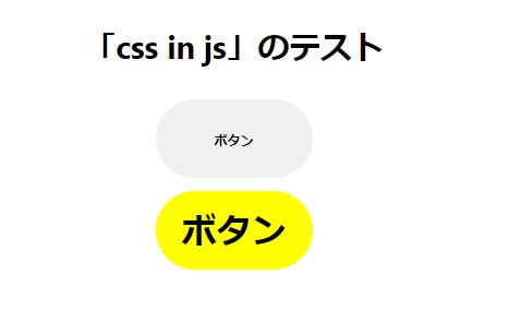
StyledButton、YellowButtonそれぞれのスタイルコンポーネントの中に、spanタグをネストしてスタイルを定義。
同じspanタグでも、違ったスタイリングをしています。
そういえば、この記事を書いている頃、chromeでcssのネストが使えるようになったと話題だったな。
最後に
styled componentsは、まだいろいろできることがるようだけど、以上にあげたところを押さえておけば、けっこう使えるんじゃないかなと思うところです。